The Psychology of Colour
We have to cover our body with something.
These coverings have evolved.
What we have lost is the intuition to whether what we are putting on our bodies is in harmony with ourselves. Speaks powerfully for us. That people can still see us with all of this stuff covering us.
If the coverings are visible and we are not, then we are 'out of balance', and others are sub-consciously less attracted to us, feel less secure about us, and less comfortable in our presence. Eventually this leads to discomfort within ourselves, sometimes causing dis-ease.
Intuition
Very 'centered', intuitive people always wear clothing that is in harmony with them.
What we have lost is this intuition, and when we get that harmony back by wearing the right clothing, it makes a psychological impact on our very selves, our self-esteem and wherever we choose to make an impact in the world.
This is not just 'having your colours done', this is not a 'fashion' trend. This is serious. And the impact on the world when we finally recognise the power of the alchemy of colour on the human body will make a significant shift in how we treat each other on this planet.
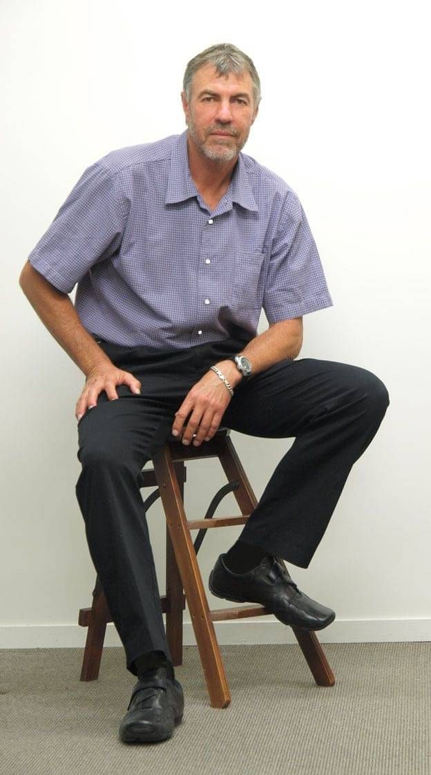
Visual Image
Here you will see the same person in a complete outfit 'wrong' first and 'right' after.
Each outfit in 'balanced' colours but one is better.....
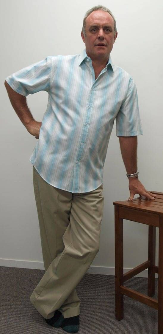
Andy's face looks puffy. His face is 'separate' from his body. Out of balance.
Which one is....
Approachable
Reliable
Professional
Confident
Responsible
Trustworthy
Dependable
Efficient
Motivated
In Charge
Friendly
Non-Threatening
Co-operative
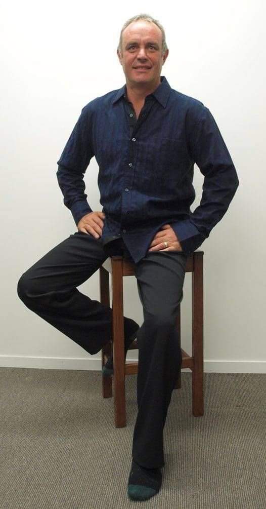
Now he is powerful. Silver jewellery intuitively chosen. Balance from head to toe. Approachable, professional, in harmony.
Harness the Power of your Visual Image.
When I use the word 'powerful' people shirk away. Fancy using the word powerful, I don't want to be powerful! Well actually you do. In the photos above Andy is not looking as confident, trustworthy or approachable but in the dark colours he is. That is using the power of colour to make people comfortable in our presence. Pretty handy power!
Attention
Another word that is important. For teachers it is important to have their audience's attention.
If you're a professional, therapist, it is important for you to look trustworthy and interested.
If you are not in harmony with your clothes people are not giving you attention, respect. They are not connecting with you and getting the benefit of your skills.
See simple style skills in Blog or Contact us to learn more.
Why?
People loose their jobs, or do not get employed because they do not 'look like they are the right 'fit for the job'.
Employees are mistreated, disrespected by employers and customers because they are not being seen, especially when they have to wear black which is only empowering for 20% of the population.
The self-esteem of all workers who are forced to wear a colour that causes them to be inadvertently disrespected.
It is subconscious human nature to not give respect to those with whom we are not able to comfortably achieve eye contact.
Professionals
Imagine what could happen if all teachers were respected?
If all counsellors were immediately trusted?
This is possible. It's called Balance and Harmony. The Alchemy of Colour.
Balance & Harmony
It is all very well learning the colours that 'suit' you but it is how you wear them that matters.
The elements of harmony are wearing colours harmonious to your self.
The elements of style are wearing the garments in balance. For instance:

W is wearing a co-ordinated colour pallete. It is just not in harmony with him.
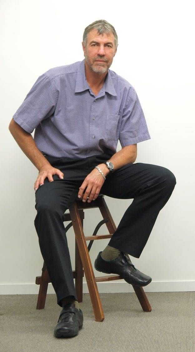
Wearing colours in harmony with him but still wearing the green socks so is not in balance yet. You notice the socks.

Black socks are not taking your attention but the gold watch is now distracting. Still not in balance.
White buttons on the shirt. They are distracting. Still not in balance.

You can now look W in the eye without any distractions.
Balance & Harmony.